Voltar paraBack to ExperimentosTinkering
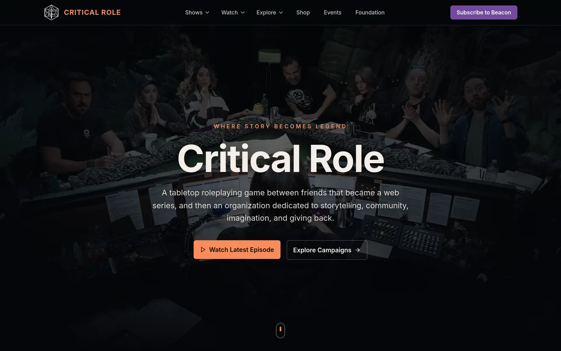
A homepage do Critical Role, pensada como um sistema de decisão.Critical Role's homepage, designed as a decision system.
Um redesign não oficial da página inicial, como exercício de product thinking, com foco em hierarquia de informação, priorização de conteúdo e fluxo de conversão.An unofficial homepage redesign, as a product thinking exercise focused on information hierarchy, content prioritization and conversion flow.
O incômodo
Assisto muito Critical Role, e a página inicial deles funciona como um catálogo: tudo tem o mesmo peso, e quem chega precisa descobrir sozinho por onde começar.
O que mais me incomodava era a pergunta mais básica de quem acompanha o canal: o que vai ao ar esta semana, e quando? No site atual, a programação é confusa e difícil de achar. E quem quer entender as campanhas, quem são os personagens e por onde começar a assistir, também precisa garimpar.
O estalo
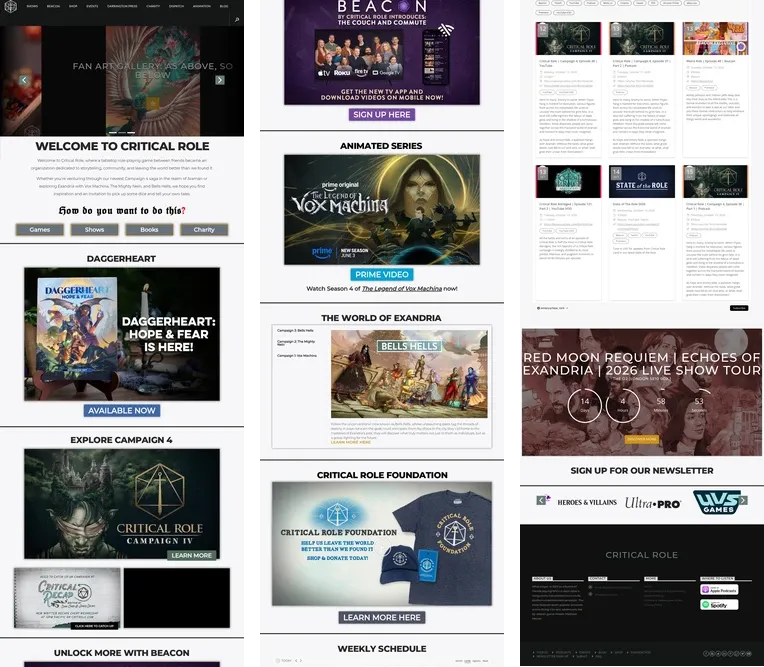
A própria página pergunta “How do you want to do this?”, a frase mais famosa do Matt Mercer. Só que as respostas são Games, Shows, Books e Charity: os departamentos da empresa. A homepage estava organizada pelo organograma do Critical Role, e não pelas perguntas de quem chega. A programação da semana, que era o que eu mais queria encontrar, existia, mas como imagem de carrossel no topo e como lista lá embaixo, depois de oito banners.
Então me coloquei no lugar de usuário, que no caso era eu mesmo, e resolvi a minha própria dor primeiro.
O que fiz
Comecei revendo a arquitetura de informação do site, e não o visual. Em vez de tratar a página como um catálogo, estruturei a navegação como um sistema de decisão, deixando claro o que o usuário precisa primeiro, o que explora em seguida e onde a assinatura entra de forma natural.
- 01 O que vai ao ar O calendário da semana logo no topo, com o que está ao vivo hoje, os horários e o episódio mais recente.
- 02 Alcançar e explorar Recaps para quem perdeu um episódio, e as campanhas, da primeira à atual, a um clique para quem está chegando.
- 03 Assinar O Beacon aparece depois de a pessoa ver o valor do conteúdo, com os benefícios claros e o teste grátis.
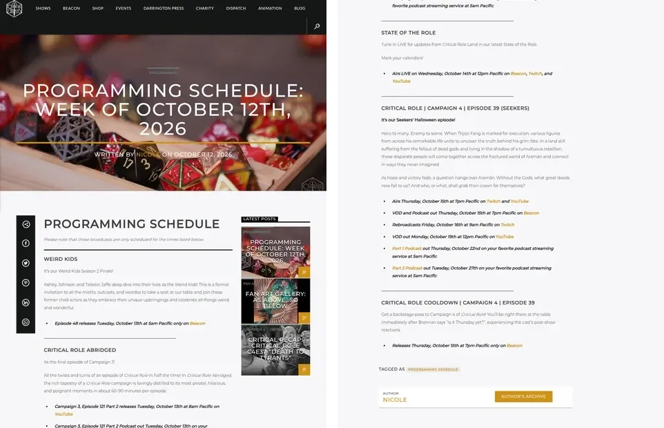
A maior mudança foi a programação. No site original, ela é um post de blog por semana, em texto corrido:
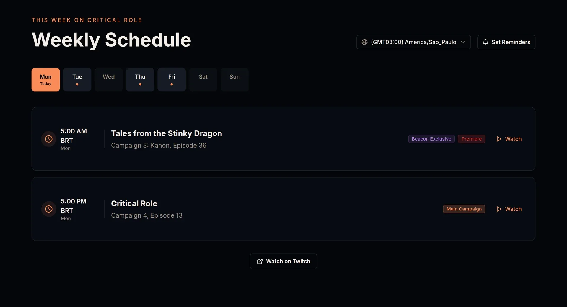
No redesign, virou um calendário: os dias da semana em abas, cada programa com horário, tipo e onde assistir, os horários no fuso de quem está vendo e um botão para receber lembretes.
O resultado
Uma estrutura mais simples e intencional, que reduz a carga cognitiva e guia melhor o engajamento: cada bloco da página responde a uma pergunta de quem chega, na ordem em que ela aparece.
O que aprendi
A primeira coisa da página deveria responder à pergunta que as pessoas mais fazem, e não à que a empresa mais quer responder.
A ordem importa tanto quanto o conteúdo. Parte do trabalho foi criar o que faltava, mas boa parte foi decidir o que vem primeiro. E a assinatura funciona melhor depois que a página já respondeu a pergunta de quem chegou.
The itch
I watch a lot of Critical Role, and their homepage works like a catalog: everything carries the same weight, and visitors have to figure out on their own where to start.
What bothered me most was the most basic question a regular viewer has: what’s airing this week, and when? On the current site, the schedule is confusing and hard to find. And anyone who wants to understand the campaigns, who the characters are and where to start watching, has to dig for it too.
The insight
The page itself asks “How do you want to do this?”, Matt Mercer’s most famous line. But the answers are Games, Shows, Books and Charity: the company’s departments. The homepage was organized around Critical Role’s org chart, not around visitors’ questions. The weekly schedule, the thing I most wanted to find, was there, but as a carousel image at the top and a list way down the page, after eight banners.
So I put myself in the user’s shoes, which in this case were my own, and solved my own pain first.
What I did
I started by reviewing the site’s information architecture, not its look. Instead of treating the page as a catalog, I structured the navigation as a decision system, making clear what people need first, what they explore next, and where the subscription fits in naturally.
- 01 What's airing This week's calendar right at the top, with what's live today, showtimes and the latest episode.
- 02 Catch up and explore Recaps for anyone who missed an episode, and every campaign, from the first to the current one, one click away for newcomers.
- 03 Subscribe Beacon shows up after people have seen what the content is worth, with clear benefits and a free trial.
The biggest change was the schedule. On the original site, it’s one blog post per week, in running text:
In the redesign, it became a calendar: the days of the week as tabs, each show with its time, type and where to watch, times in the viewer’s own time zone, and a button to set reminders.
The result
A simpler, more intentional structure that lowers cognitive load and does a better job of guiding engagement: each block on the page answers a visitor’s question, in the order it comes up.
What I learned
The first thing on the page should answer the question people ask most, not the one the company most wants to answer.
Order matters as much as content. Part of the work was creating what was missing, but a lot of it was deciding what comes first. And the subscription works better once the page has already answered the visitor’s question.